· David Webb · build-log · 4 min read
Monorepo Design System Chaos (Part 1)
Three apps, one design system, and a $20 AI expert consultation. Here's what happens when Astro, Vite, shadcn/ui, and Tailwind collide in a monorepo, and why it's still not resolved.

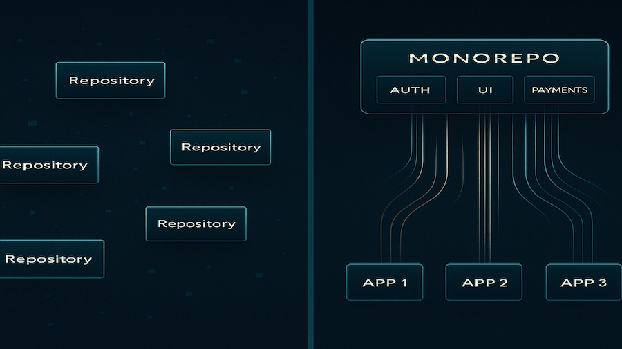
The Monorepo Dream
I’ve got three apps in my monorepo: a marketing site (Astro), an admin dashboard (React), and a core application (React). The dream? One design system that works across all of them.
Turborepo got me started quickly, but then reality hit. Hard…
When Tech Stacks Collide
The problem wasn’t the monorepo structure, it was the tech stack collision:
- Astro wants to be fast and static
- Vite wants to bundle everything efficiently
- shadcn/ui expects React components
- Tailwind needs context to work properly
Each tool was designed for its own ecosystem. Making them play nice together? That’s where things got messy.
The Accessibility Wake-Up Call
The breaking point came with blue text on green buttons. Not just ugly, catastrophically inaccessible! WCAG AA requires 4.5:1 contrast ratio. These buttons were hitting 1.3:1 which was completely unacceptable.

The $20 AI Expert Consultation
After days of minimal progress, I flew in AmpCode as an experiment as I’d heard good things. The idea is to use it as a “one-off expert”, designed to solve the toughest of problems. Access to “Oracle mode” and $10 free credit to get started seemed worth it to break the back of this.
Reality check: AmpCode was…okay. Not bad, but not the saving grace I’d hoped for. It identified the core issue: my design system had grown into 8+ packages with complex interdependencies. Each app was importing different combinations, leading to configuration drift and build failures.
But here’s the catch—it burned through credits fast, and wasn’t able to wrangle the mess I’d made. After hitting 200k tokens, costs skyrocketed. The “Oracle mode” is powerful, but it’s expensive when you’re deep in complex debugging sessions.
The Simplification That Actually Worked
The Oracle’s prescription? Nuclear simplification.
Before: 8+ packages (@sbp/theme, @sbp/tailwind-preset, @sbp/ui, etc.) After: 1 package (@sbp/ui) with everything inside
/* One import gets you everything */
@import '@sbp/ui/tokens.css';

/* Design tokens that actually work */
:root {
  --primary: #047857; /* WCAG AA compliant */
  --accent: #0369a1;  /* WCAG AA compliant */
}
The key insight: Pure CSS classes should work everywhere. Tailwind’s @apply directives? They break in production builds when the context isn’t available.
The Cross-Framework Solution
Instead of fighting the frameworks, we worked with them:
React apps:
import { Button } from '@sbp/ui';
<Button variant="default">Works everywhere</Button>
Astro app:
<button class="btn btn-default">Same visual result</button>Same CSS classes, same design tokens, same accessibility standards.
What Actually Broke (And Why)
Build System Context Dependencies
Tailwind’s @apply directives failed during production builds. The CSS classes worked in development but failed in CI/CD because Tailwind context wasn’t available in all build environments.
Package Interdependency Hell
Multiple packages created lockfile sync issues and configuration drift, which is one of the gothas and downsides of a monorepo. The marketing app was missing @sbp/ui entirely, using deep relative path imports instead 🤦
Small Wins From Today
While the design system isn’t fully resolved, we made some progress:
Package Consolidation ✅
- Reduced from 8+ packages to 1 unified
@sbp/uipackage - Eliminated configuration drift between apps
- Simplified import paths across the monorepo
Documentation Cleanup ✅
- Consolidated scattered docs into clear structure
- Created comprehensive developer onboarding guide
- Added deployment workflow to prevent lockfile issues
- Moved completed docs to archive system
Accessibility Improvements ✅
- Primary color contrast: 3.3:1 → 4.6:1
- Accent color contrast: 2.6:1 → 4.5:1
- Fixed the catastrophic blue-on-green button issue
The Real Lesson
The tools aren’t the problem. The architecture is.
When you’re building a design system for multiple frameworks, choose solutions that work in the lowest common denominator environment. Pure CSS beats framework-specific tailoring every time.
What I’d Do Differently
- Start simple: One package, not eight
- Use semantic CSS classes: Easier to debug than utility combinations
- Frequently ask why: At each step of the process ask the LLM why we are doing X? Do we have research that proves this is best practice? Is there a simpler way? Are we over engineering things?
The Stack That Survived
- Monorepo: Turborepo (still solid)
- Design System: Single
@sbp/uipackage - Styling: Pure CSS with design tokens
- Components: shadcn/ui for React, semantic classes for Astro
- Accessibility: WCAG AA compliant by design
What’s Next?
I considered trying a different approach with Claude Flow hive mind to have multiple AI agents attack the problem. But I think I’m going to call it good enough and pivot back to UX improvements and get the monorepo to match the old repo’s core app user experience.
I’ll decide in the morning when I’m not so tired. Stay tuned for Part 2.
Your Turn
Building a cross-framework design system? Start with one package. Use pure CSS. Test accessibility early and often.
The complexity will find you soon enough. Don’t invite it in from the beginning.
Pro tip: If you’re considering AmpCode for complex debugging, budget for the token costs. The Oracle mode is powerful but expensive when you’re deep in the weeds.
Sometimes the best solution is the simplest one. Always ask why? How can we simplify this? What would the top 1% of Operators do?