· David Webb · design · 4 min read
Creating a Custom Wordmark for howibuild
How I designed and implemented a custom 'howibuild' wordmark using Inkscape, then built a complete favicon system for different use cases.

Creating a Custom Wordmark for howibuild
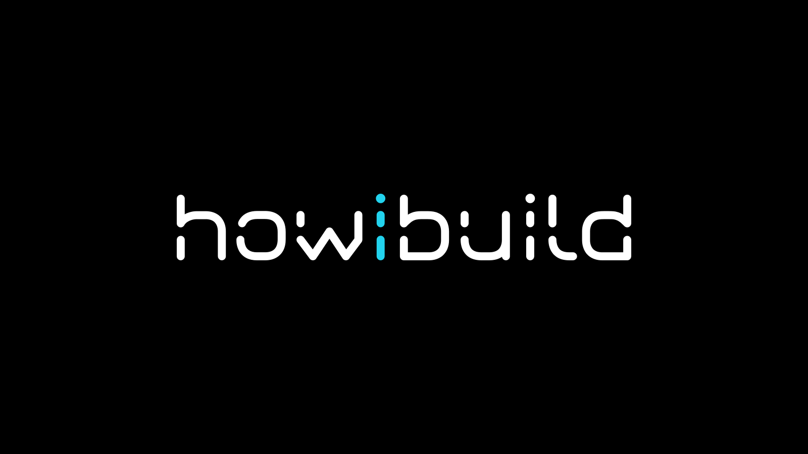
Today I designed and built a complete custom wordmark system for “howibuild” from scratch, replacing all the generic AstroWind assets with a professional, cohesive brand identity.
The Challenge
Starting with AstroWind, I had generic placeholder assets:
- Stock favicon (Astro rocket icon)
- Default logo using system fonts
- No brand identity or visual consistency
I wanted to create a distinctive “howibuild” wordmark that would work across different contexts - from the main site header to tiny favicon sizes.
Step 1: Designing the Wordmark
I selected “Neon Future 2.0 Demo” - a futuristic, tech-focused font that perfectly matches the “howibuild” brand identity. This font gives the wordmark a distinctive, modern feel that stands out from generic sans-serif options.
Credit: Neon Future 2.0 Demo by Typodermic Fonts
The wordmark design features:
- “how” and “build” in white
- “i” in cyan (RGB: 34, 211, 238) as an accent element
- Bold weight for maximum impact
Step 2: Creating SVG Assets with Inkscape
Instead of trying to load custom fonts via CSS (which can be unreliable), I decided to generate SVG assets directly. This approach offers several advantages:
- No font loading delays
- Consistent rendering across all browsers
- Better performance (one less HTTP request)
- Industry standard for logos and wordmarks
Learning Inkscape for Logo Creation
I downloaded Inkscape (free, open-source vector editor) and learned the fundamentals of logo design:
- Font Installation: Added the custom font to
/Library/Fonts/on my Mac so Inkscape could access it - Text Tool: Created text with the custom font
- Color Management: Used precise RGB values (34, 211, 238 for cyan accent) - Inkscape’s color picker shows RGB and HSL, not hex
- Typography: Applied proper font weights and spacing
- Export Options: Learned to export as SVG with proper sizing
- Text to Paths: Most importantly - converted text to paths using “Path → Object to Path” to make fonts independent
Critical Step: Converting text to paths removes the font dependency entirely. The SVG becomes a pure vector graphic that renders exactly as designed without needing any fonts loaded on the website.
The Sizing Challenge
This is where things got interesting. Text logos are naturally wide and short (rectangular), but favicons work best as squares. I had two options:
Option A: Horizontal Layout (116mm × 17mm)
howibuild- Great for headers and main logos
- Terrible for favicons (becomes unreadable at 32×5 pixels)
Option B: Stacked Layout (59mm × 45mm)
howi
build- Better proportions for favicons
- More square aspect ratio
- Still recognizable at small sizes
I created both versions to serve different purposes.
Step 3: Favicon Generation
For the .ico file (fallback for older browsers), I used favicon.io:
- Uploaded the stacked SVG version
- Generated a proper multi-size
.icofile - Replaced the stock
favicon.ico
This tool creates optimized .ico files with multiple embedded sizes (16×16, 32×32, etc.) for maximum compatibility.
Step 4: Implementation
Logo Component (Header)
---
import logoSvg from '~/assets/favicons/howibuild-logo.svg';
---

<img
  src={logoSvg.src}
  alt="howibuild"
  class="h-12 md:h-10 w-auto"
/>
Key Points:
- Uses the SVG with text converted to paths (no font dependencies)
- Larger size (
h-12 md:h-10) for better visibility - Scales perfectly at any resolution
Favicon Component
---
import favIcon from '~/assets/favicons/favicon.ico';
import favIconSvg from '~/assets/favicons/howibuildfav.svg';
---

<link rel="shortcut icon" href={favIcon} />
<link rel="icon" type="image/svg+xml" href={favIconSvg.src} />
<link rel="mask-icon" href={favIconSvg.src} color="#22d3ee" />
Key Learnings
1. Don’t DIY Logo Extraction
I initially tried creating a browser-based font extraction tool (favicon-extraction.html). This was overcomplicated and unreliable. Use proper design tools like Inkscape instead - it’s free, powerful, and designed for this exact purpose.
2. SVG > Font Loading for Wordmarks
Loading custom fonts via CSS for logos is unnecessary complexity. SVG generation gives you:
- Perfect control over rendering
- No loading dependencies
- Better performance
- Industry-standard approach for brand assets
Bonus: You only need to install the font locally for design tools - no web font loading required!
3. Size Matters for Different Use Cases
The rectangular vs. square challenge is real. Wordmarks are naturally wide, but favicons need to be square. Having two versions (horizontal for logos, stacked for favicons) solved this elegantly.
4. Professional Tools Make a Difference
Learning Inkscape was worth the investment. It gave me:
- Precise control over typography
- Professional color management
- Proper SVG export options
- Industry-standard workflow
Final Result
- ✅ Custom wordmark in header using horizontal layout
- ✅ Custom favicon using stacked layout for better proportions
- ✅ No stock assets - completely custom brand identity
- ✅ Performance optimized - no font loading delays
- ✅ Cross-browser compatible - SVG + .ico fallback
The wordmark system now perfectly represents the “howibuild” brand with a distinctive, professional appearance that works across all contexts.
Tools Used
- Inkscape - Free vector graphics editor
- favicon.io - Online favicon generator
- Neon Future 2.0 Demo - Custom font
- Astro + Tailwind - Web framework and styling
This approach gives you complete control over your brand assets while maintaining excellent performance and compatibility.


